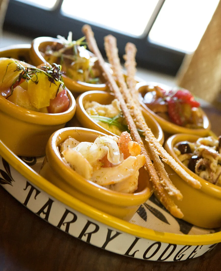
Tarry Lodge
One part American. One part Italian. Two parts fun.
CLIENT
Tarry Lodge
SCOPE
Positioning & Messaging
Brand Identity
Architectural Signage
Menu Strategy
Packaging
Signage
YEAR
2010 - Present
Tarry Lodge is a true Italian trattoria experience designed to provide a casual environment for any gathering of friends, business associates or family.
Its menu features classics from the entire spectrum of Italian food — from simple, authentic pizzas to classics like osso buco and strozzapretti all’Amatriciana.
Housed in a building that had been a saloon (did someone say speakeasy?) for over 100 years, the Tarry Lodge reflects a particular brand of American masculine style in perfect unity with an Italian, rustic feel. Spaghetti Western in the best sense – singular, bold, sparse, atmospheric, mythic.
The design concept for both brands and their related packaging was to develop a bold aesthetic which was a hybrid of Italian and American typography and printer’s ornaments. For Tarry Lodge, this meant creating ornamental bands which were reminiscent of marble floor patterns and friezes.


