Pour Wines
Can retail design strategy take the confusion and anxiety out of picking the perfect Chardonnay? We think so.
CLIENT
Pour Wines
SCOPE
Creative Direction
Positioning & Messaging
Brand Identity
Print Collateral
Signage
YEAR
2007 - 2009
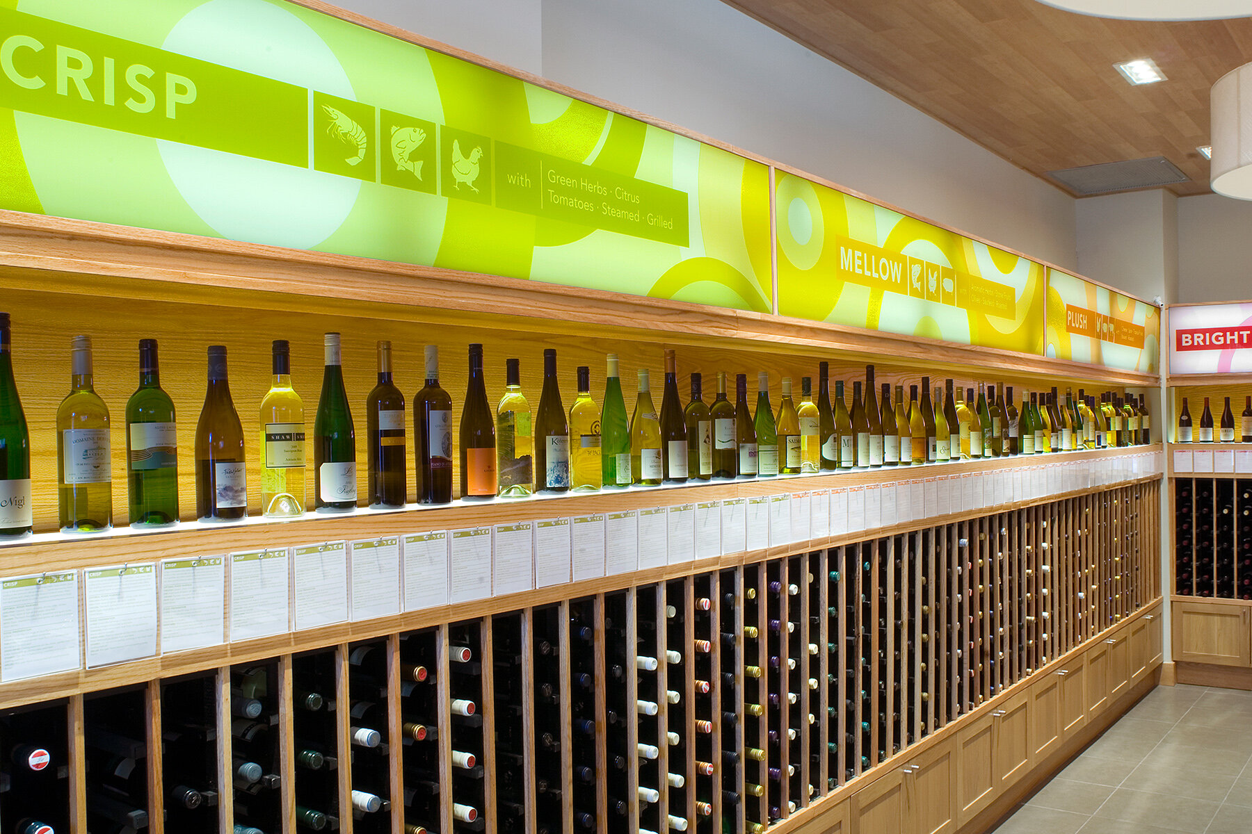
As many know, buying wine can be extremely anxiety-provoking. The owner of Pour came to us with a unique solution to this problem: to enable customers to make educated wine selections based on what foods and flavors they were planning to serve.
Our first task was to create a brand identity which echoed the modern, non-traditional environment of the jewel box-like store on Manhattan’s Upper West Side.
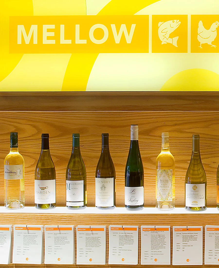
Secondly, we worked with the owner and sommelier to develop a visual and narrative system that would present and organize the curated selection to customers. It was an exercise in simplicity and clarity, whose success lies in our populist approach that feels accessible and educational, and most of all fun.


