Mozza
Pizza: Many have tried. Few have succeeded. Mozza takes restaurant brand experience to a new level.
CLIENT
Mozza
SCOPE
Brand Identity
Architectural Signage
Menu Strategy
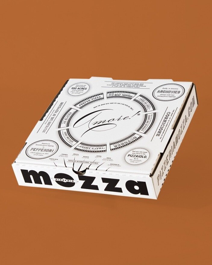
Packaging
YEAR
2006 - 2016
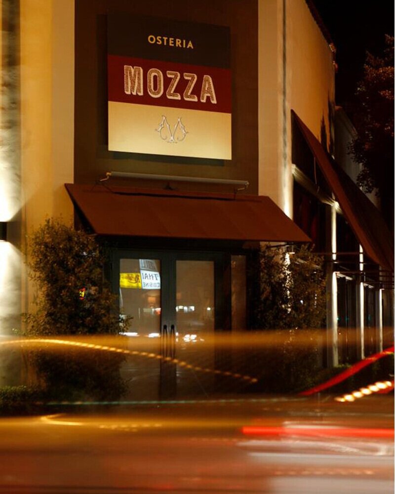
For well over a decade, the culinary epicenter of Los Angeles food has been the corner of Highland and Melrose where one can find Nancy Silverton’s Mozza Osteria and Pizzeria.
The allure of both restaurants is the artful combination of a familiar simplicity and sublime artistry. A presentation of the best of Italian cuisine and lifestyle — the ability to be both unassuming and completely at ease and, at the same time, surprisingly mind-blowing.
Pizza can be serious fun, where the joy is in the crust, the toppings…and the conversations. From the slightly off-beat logo (mozzarella anyone?) to those boldly playful placemats, this space keeps customers talking, smiling and coming back for more.
The Mozza Bar is the centerpiece of the Osteria, the design of which is every bit as bold and accessible as the pizzeria next door, yet slightly more refined.
The success of our work can be measured by the James Beard Foundation nomination we received that year for Best Restaurant Graphics but also by the brand’s longevity.
The branding has remained virtually intact since opening and has provided the foundation for expansion to cities nearby as well as Asian outposts.


